flysend
omnichannel cdp — a nine-page product site for a b2b marketing automation platform

initial brief
challenge
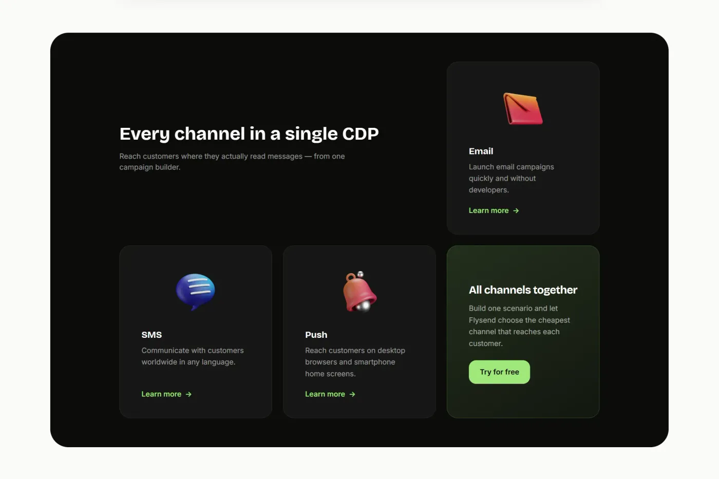
Flysend is an omnichannel CDP: four modules — Campaigns, Marketing, Transport, Sales — and four delivery channels running on one customer database. The modules are sold separately or together, in any combination.
That is the structural problem. Explain it all on one page and you get a feature dump nobody finishes reading. Give every combination its own page and the site sprawls past twenty. Either way the reader loses track of what the product actually is.
approach
I treated it as a product surface, not a landing page. One component library, nine pages: home, one page per module, one per channel, plus pricing. The homepage stays a map rather than a catalogue — it introduces the four modules and sends people deeper.
Every page is the same set of sections in a different order. The spacing, type and layout logic are identical — so the platform still reads as one product wherever someone lands.
Astro renders all of it as static HTML. Only the parts that need behaviour — nav dropdowns, mobile menu, pricing switch, signup validation — ship as separate islands. Everything else ships no JavaScript.
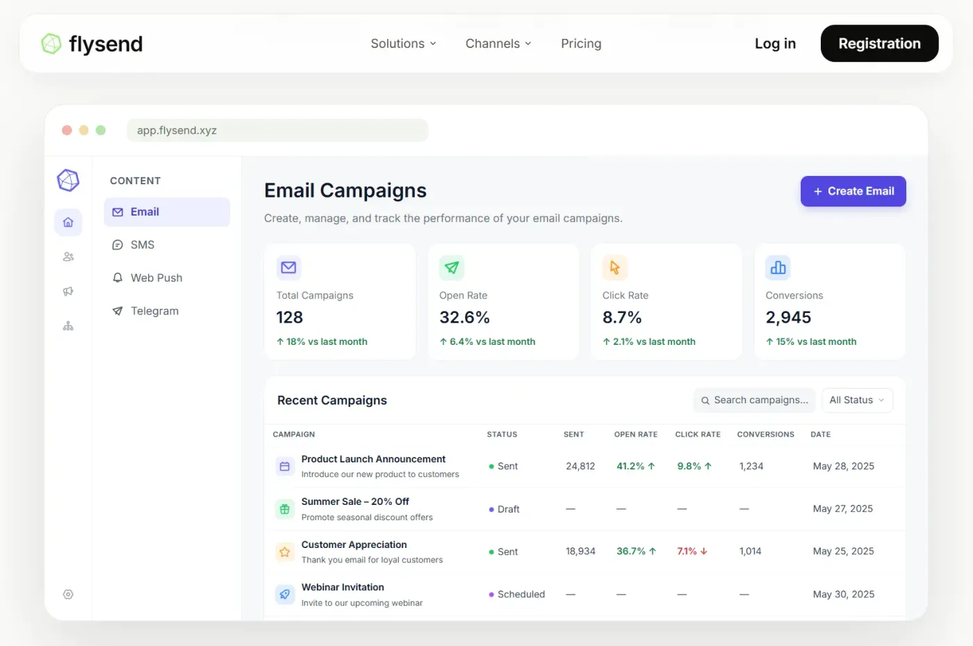
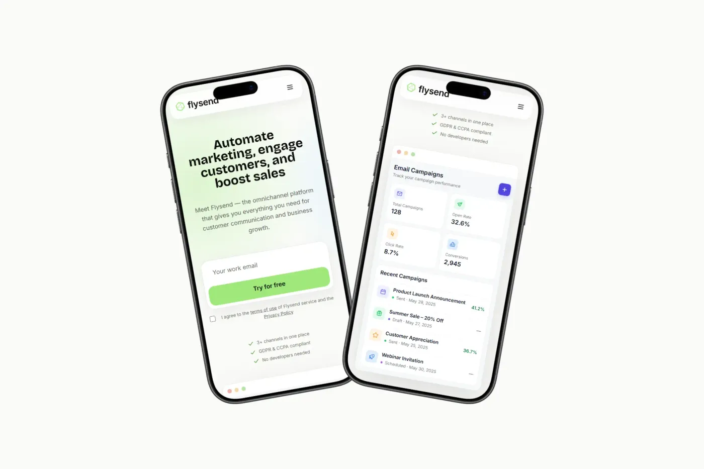
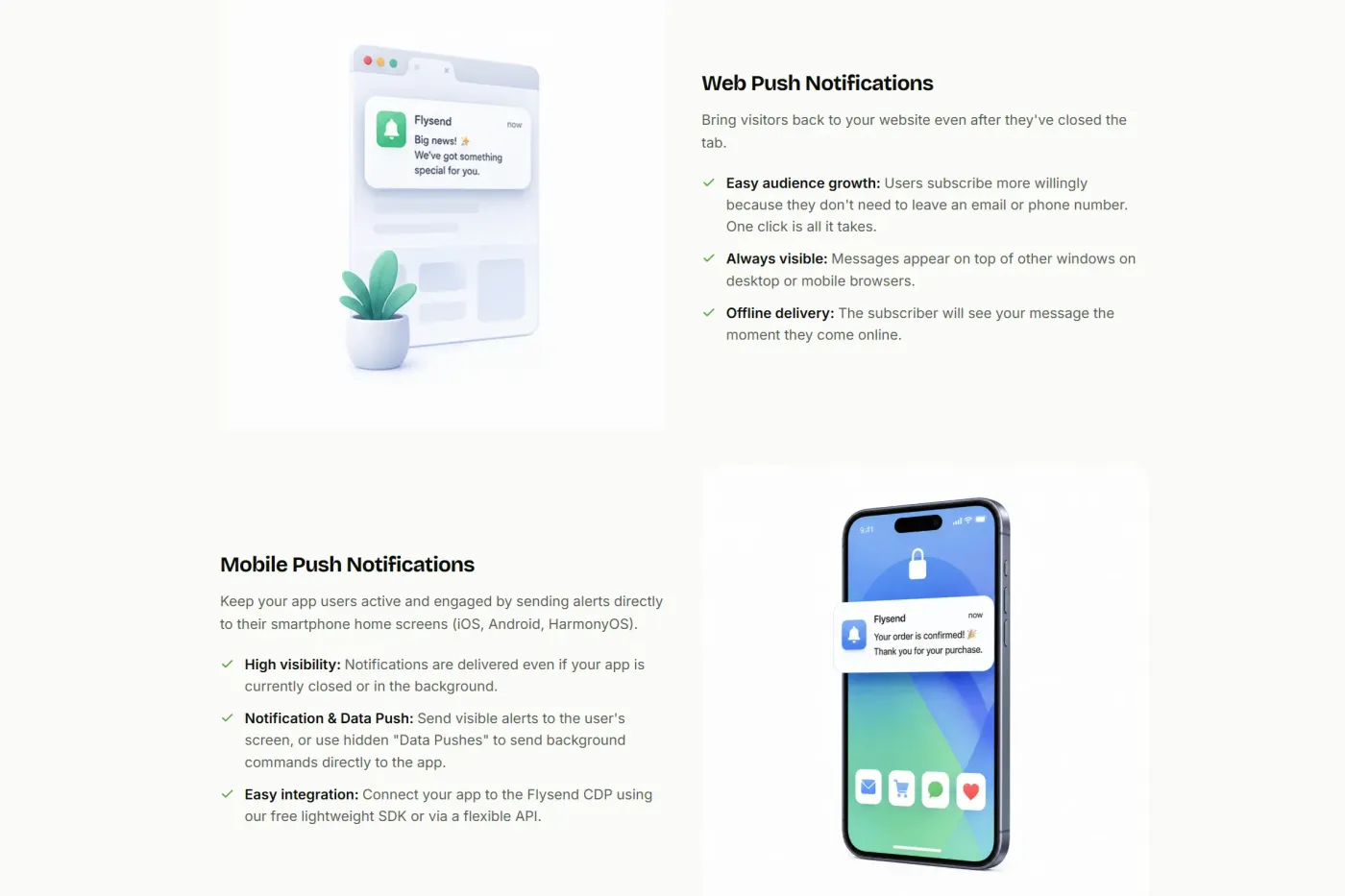
The product shots aren't screenshots. Dashboards, campaign tables, cascade diagrams and event cards are built in HTML and CSS, so they stay sharp on any display and weigh almost nothing.
website
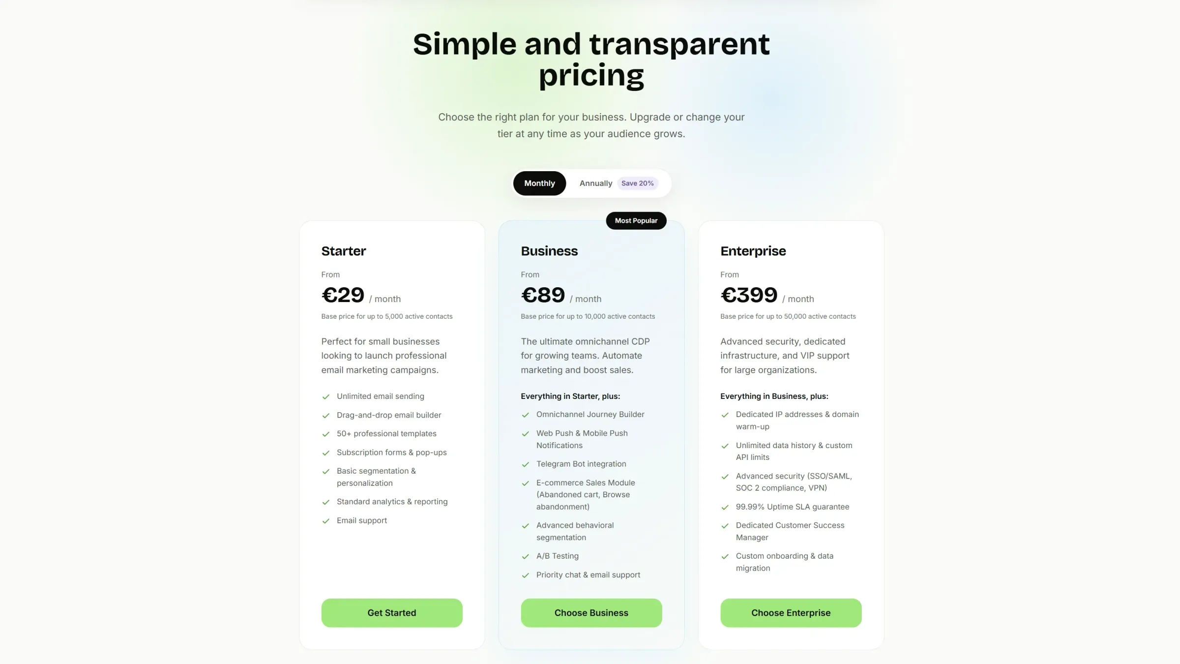
Designed and built in 4 weeks on Astro and Tailwind. Module and channel copy sits in typed data files. Pricing tiers and FAQ content live in Sanity, so a price change or a new question is a publish, not a deploy. Static build, deployed on Vercel.
results
Pages with no interactive parts ship zero JavaScript — they arrive as plain HTML with nothing to hydrate. The whole homepage, product mockups included, weighs less than a single hero photo on most marketing sites.
Adding a new module page means reusing sections that already exist. No new design round, no new code.